Writing with royal icing is arguably one of the most challenging things to do with royal icing. Believe me, I’ve shed many a tear over it! I’m completely self-taught with royal icing (even writing with royal icing) and I’m here to share the tips & tricks I’ve learned along the way to hopefully make your experience easier!
*DISCLOSURE: This post contains affiliate links which means that, at no additional cost to you, I may earn a small commission if you make a purchase from one of my links. I greatly appreciate your support!
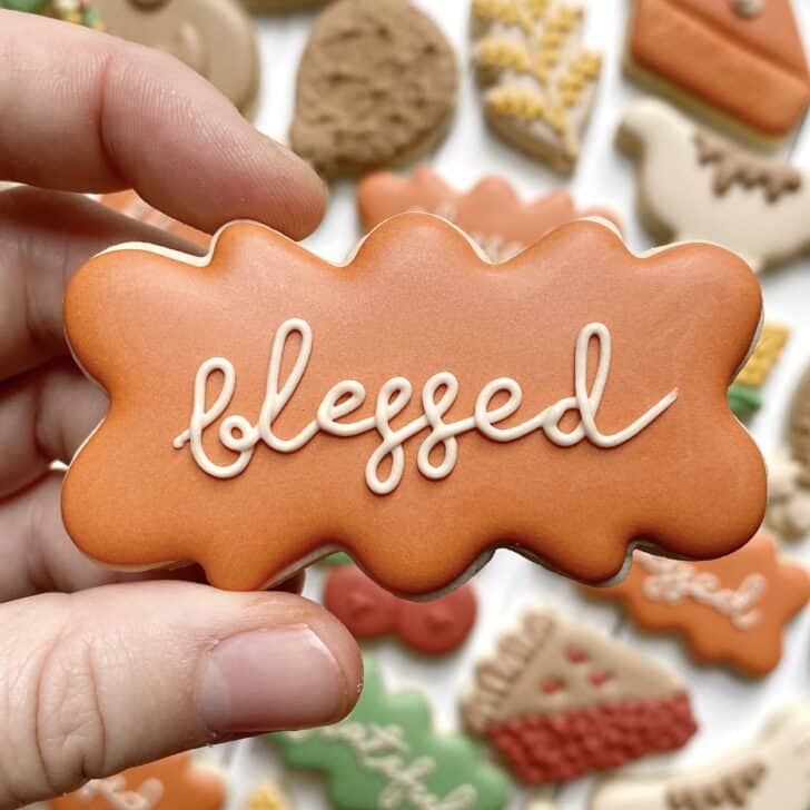
Before we all get too intimidated looking at photos of the writing with royal icing that I’ve perfected over the years, let’s take a look at the first cookies I ever wrote on:

Post Directory
Click on section to be brought directly there
Different Methods for Writing with Royal Icing
There are three main ways that you can execute writing with royal icing: 1) with a projector, 2) with tissue paper or 3) freehanded.
Projector
This is probably the most common way that you see cookiers write with royal icing, but it’s definitely the most expensive! It requires purchasing a projector (the projectors I have are linked below). And while it is the most expensive, unless you’ve been mastering the freehanded for years, it’s definitely produces the most consistent and refined look!
The projector that I use: I own both of these projectors. I first owned the Pico and purchased the Bluetooth as an upgrade. If budget is a concern, the Pico gets the job done (just make sure that you’re plugging it in correctly!). Otherwise, I recommend the Bluetooth – it has a better/brighter image
- 1) https://amzn.to/3348i24 (affiliate link) – Pico
- 2) https://amzn.to/2URI0dV (affiliate link) – Bluetooth
- I believe one or both of these projectors are sold out on Amazon. I’ve never personally used the following projectors, but I know people that use them and like them!
- https://amzn.to/3FX7r6N (affiliate link)
- https://amzn.to/3WPzQBw (affiliate link)
- I believe one or both of these projectors are sold out on Amazon. I’ve never personally used the following projectors, but I know people that use them and like them!
It can take a while to get used to using a projector (figuring out the right angle is always a challenge), a projector is expensive and some can be quite finicky (we’ve all had one die on us at midnight in the middle of a big order), but it’s definitely worth the investment if you do a lot of cookies with lettering as it makes large volumes much easier. And a note on the angle: yes, the projector is always going to be in the way somehow!
Tissue Paper
Tissue paper is a method I’ve only personally tried out once, but I know it’s a popular technique taught in online classes and communities where it’s harder to find projectors. This is a several step process that includes:
- Purchase white tissue paper (yes, this is the same tissue paper you use when wrapping presents)
- Print out the lettering in the EXACT SIZE it’s supposed to be for the cookie (this part I find to be the most challenging–at least with a projector you can adjust the size while you’re using it)
- Take a small square of the tissue paper and trace the lettering from the printout with an EDIBLE MARKER
- On a mostly/completely dry flooded cookie, use the tissue paper outline to then again trace the lettering on the cookie with the edible marker (the paper is so thin that the ink will go straight through the paper onto the icing)
- Now you get to pipe the lettering using the outline! Easy peasy.
I like this method because 1) you don’t have to buy an expensive projector and 2) you get the ease of freehanding (no projector in your way) with the assistance of an outline.
That said, I don’t like this method because 1) printing out the exact size stresses me out and 2) it’s all too easy to not completely cover up the marker outline (either because your outline was too thick/uneven and/or your icing isn’t piped thick enough).
Freehand
Freehanded lettering is just that: you don’t use any assistance and just start writing! It is arguably the “fastest” because you don’t have to set anything else up and the “easiest” in the sense that you can get straight to writing! But many also see it as the hardest because you don’t have any assistance from a projector or tissue paper.
Whether or not I choose to use a projector for a set relies on the complexity of the lettering and my mood. To be totally honest: if I can get away with freehanding, I will!
Unless you’re an expert freehander, you’re going to see a difference between a projector/tissue paper vs freehand. And while the freehanded never looks “perfect” to me, it’s good enough!

And, of course, the best way to get better at freehanding is to practice, practice, practice!
Different Kinds of Writing with Royal Icing
Simple Line Lettering: Single Line
The simplest form of lettering is this simple, single-line piping. There is no pressure piping or varying of pressures. In other words, you are applying consistent/regular pressure on the icing the entire time. It is all done with the same piping technique you’d outline a cookie (always making sure to lift the icing off the surface of the cookie in between each touch point on the cookie).

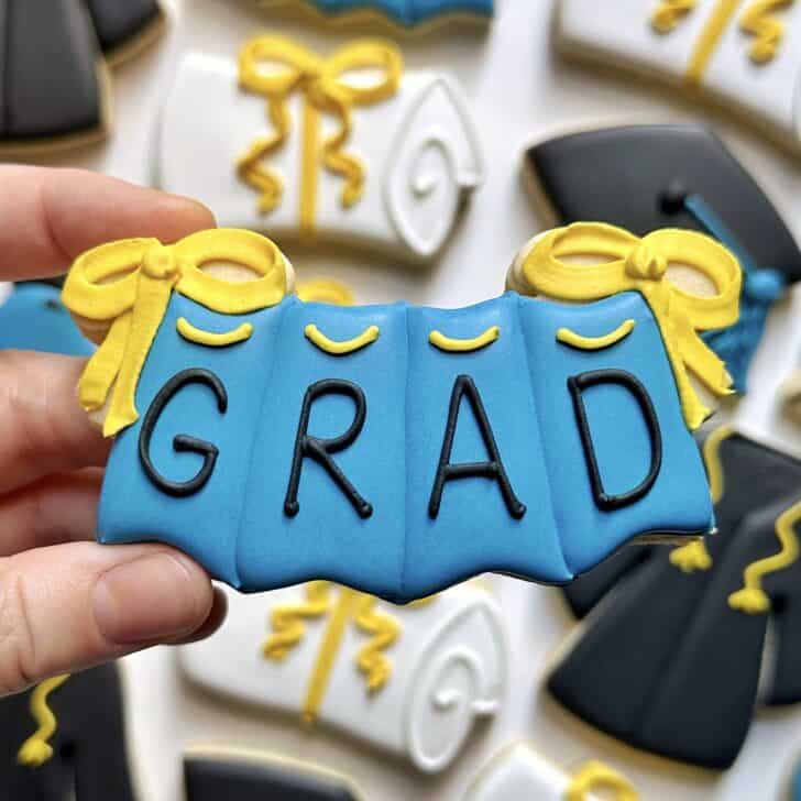
Want to learn exactly how to make this graduation set from start to finish? Check out my online Graduation class!
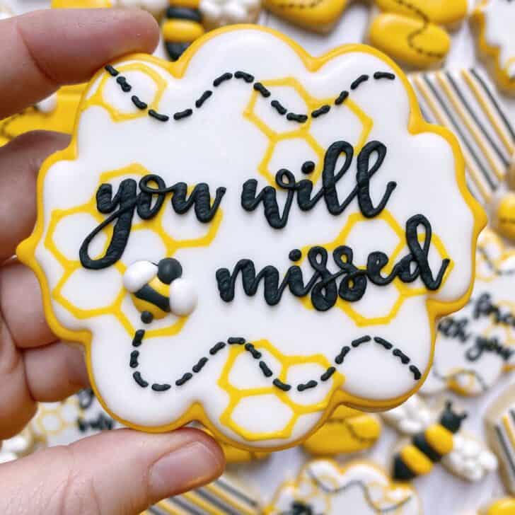
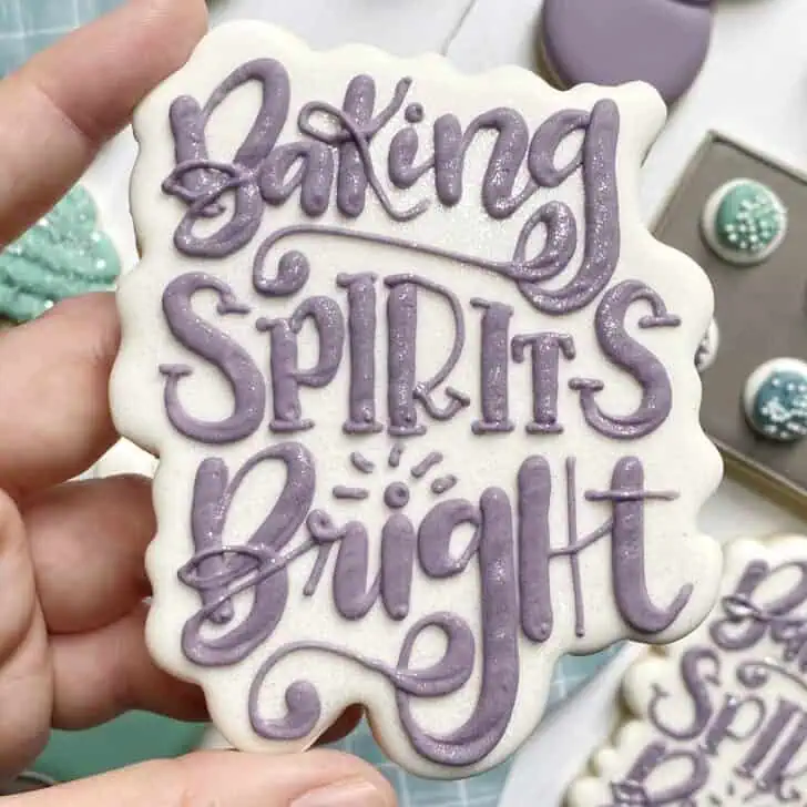
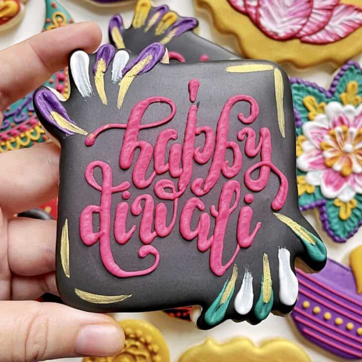
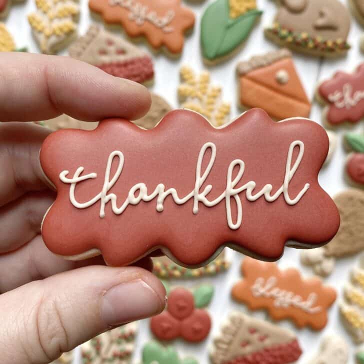
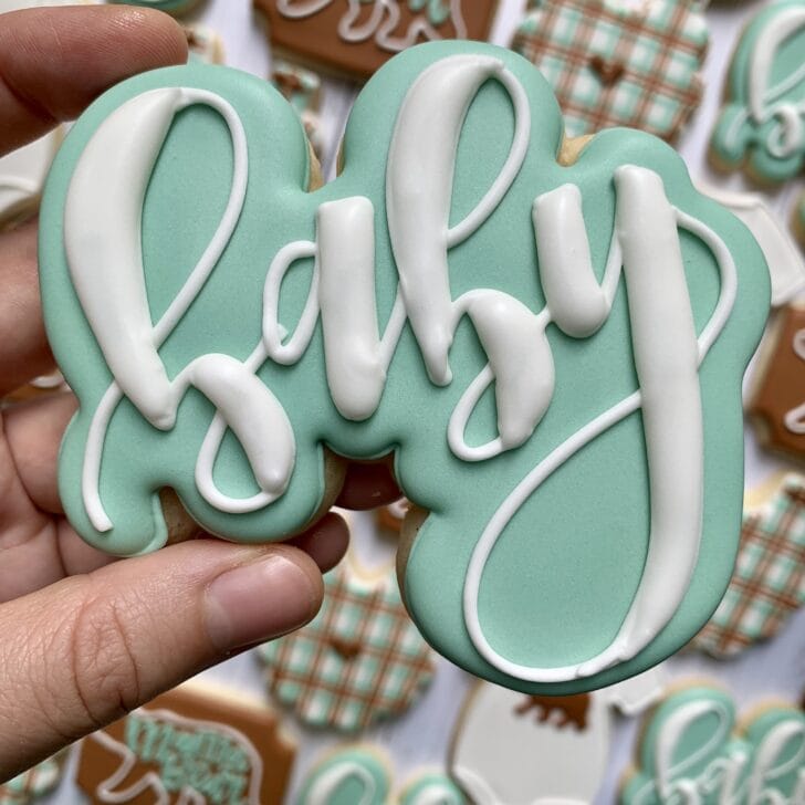
Simple Line Lettering: Script
A slightly different iteration of the previous example, this version has the same piping technique but with a script font. This tends to have a lot fewer touch points on the icing, so you’re lifting the icing off the surface of the cookie for much of the lettering.
This is the one type of lettering where I think it’s okay to use a slightly thicker consistency (intentionally or unintentionally) as the thicker consistency can create more volume in the overlaps of lines. Typically I recommend a soft peak piping consistency for lettering, but for this you could use more like a medium peak piping consistency and be AOK.

Pressure Piped Lettering: Consistent
“Pressure piping” is when you apply added pressure to create a certain width/effect/design with the icing, instead of just a standard “thin” line to outline, for example. There are a couple different ways to use pressure piping with writing: one I would call “consistent” and the other “combination”.
The consistent pressure piping means you are applying consistent pressure the entire time you are piping to create an evenly thick amount of icing. You are also keeping the tip of the piping bag flush with the surface of the cookie (i.e. you are NOT lifting the bag off the surface as you pipe).
The “combination” piping includes a combination of pressure piping and regular piping pressure (I’ll get to example of this later on).
Consistency is always important, but I find it especially pronounced with this technique. If your icing is too thick, you’ll see the jagged strokes on the thicker portions. If your icing is too thin, then you won’t be able to tell much of a different between the thinner and thicker portions.
Side bar: the consistent and combination terminology are not official terms. Just what I’m using to help describe them!
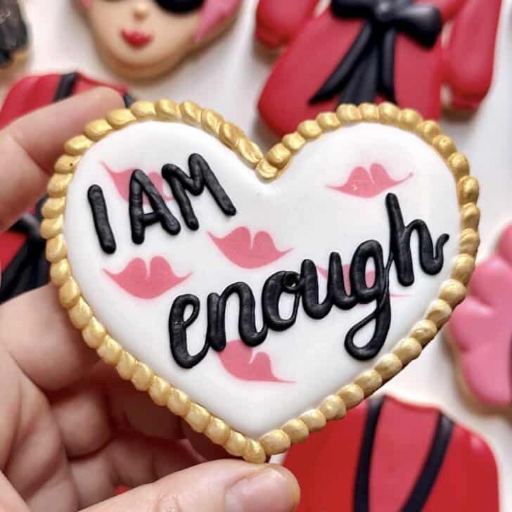
This first example of “I AM” is the more straightforward example of consistent pressure piping. The “enough” is an example of combination pressure piping.
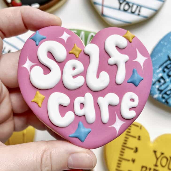
This next example of “self care” uses consistent pressure piping to still create a varied thickness of lettering.
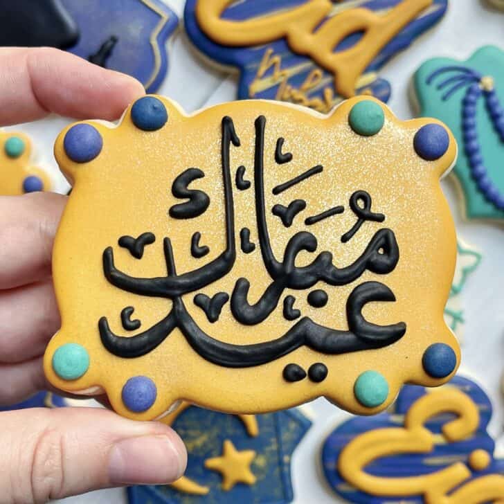
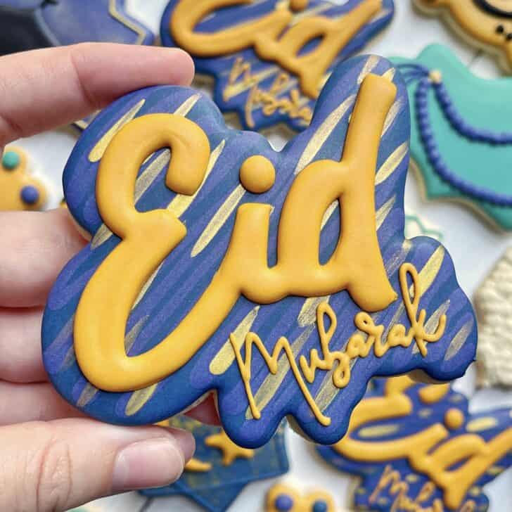
This last example of “Eid Mubarak” in Arabic shows another variation of consistent pressure piping to create varied thicknesses.
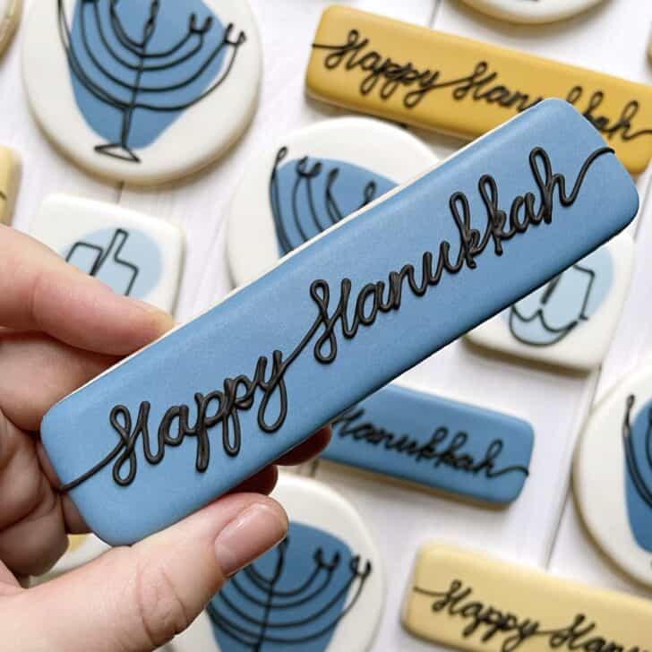
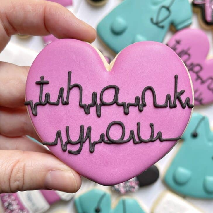
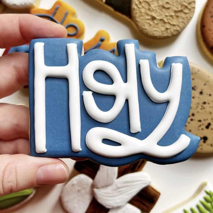
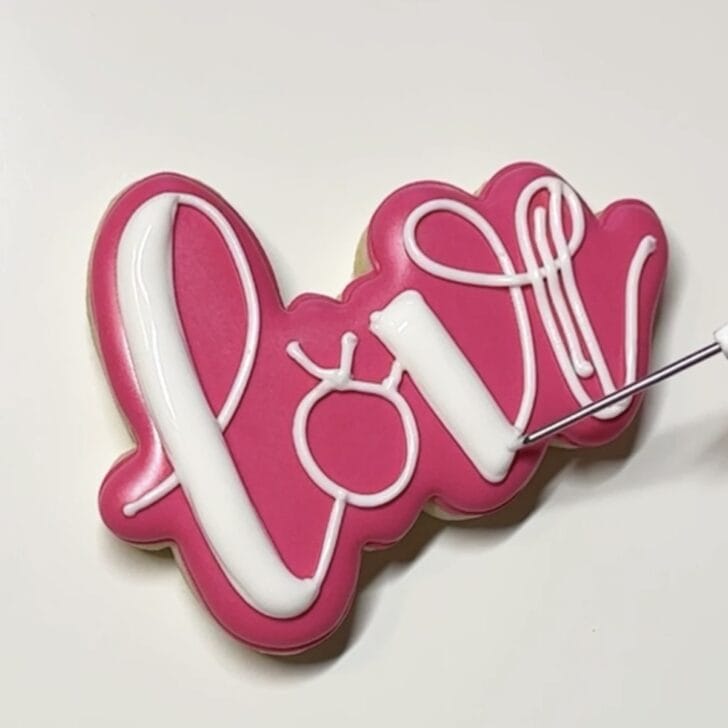
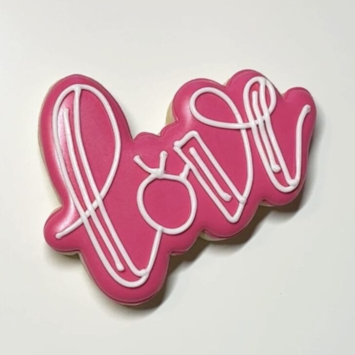
Pressure Piped Lettering: Combination
The “combination” pressure piped lettering is probably the most common these days. It is the royal icing version of brush script. Generally speaking, on the down stroke you apply consistent pressure while the tip of the bag is flush with the surface of the cookie, and then on the up stroke you release pressure to just standard/outline pressure and simultaneously lift the icing off the surface of the cookie.
You’ll see in my examples that the up vs. down stroke rule doesn’t always apply. What is also consistent, however, is that there is a combination of the thick pressure piping and the thin regular piping.
This type of writing is quite popular due to the lyrical bouncy effect. It is also, however, arguably the hardest to do well as you are varying pressure on the bag as you pipe. It’s a long of things to be doing at the same time!

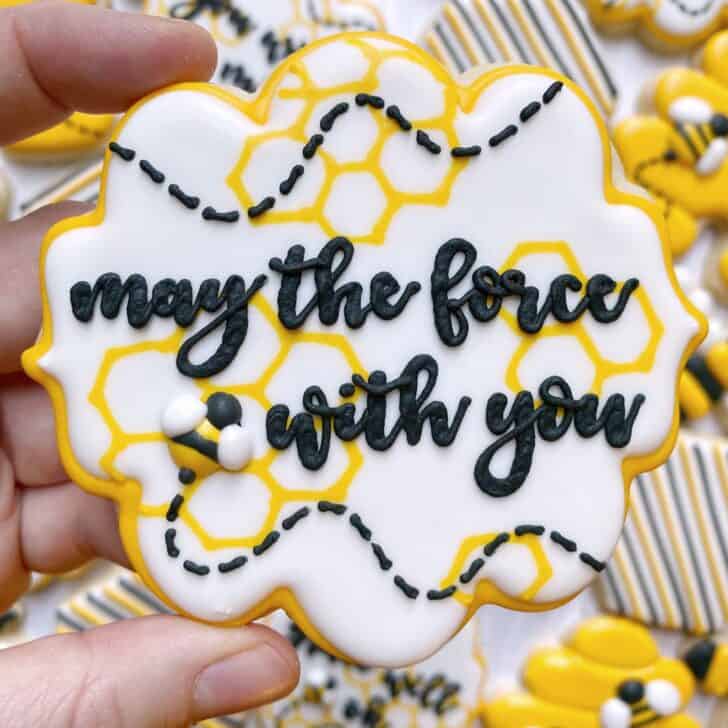
Outline and Flood Lettering
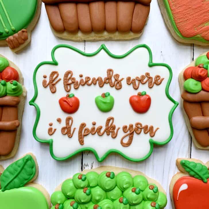
The most intimidating type of writing for me has always been the outline and flood technique. I’m not sure why as it employs the exact same concept as outlining and flooding a cookie. First, you outline with a soft peak piping consistency. Then, you flood with any sort of flood consistency. And the fonts can vary: sometimes the letters have uniform thickness and sometimes they have that bouncy combination thickness.
Combination of Types Lettering
This section is purely to show you how you can combine different types of writing and fonts to create an awesome effect!


Jump to Post Directory / Top of Page
General Tips & Tricks for Writing with Royal Icing
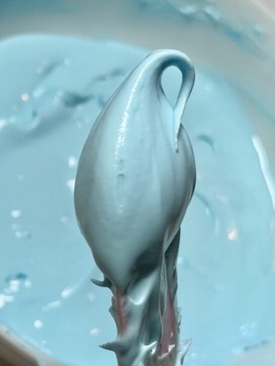
Consistency is key
It all starts with consistency. My go-to for writing with royal icing is a soft peak piping consistency. This consistency is perfect because it’s thick enough that it holds its shape and can maintain the integrity of overlapping lines, but it’s thin enough that when doing pressure piping you can settle the fatter downstrokes smooth.
If you’re unsure of whether or not you’re achieving a true soft peak, it’s better to air on the THICKER side than the thinner side. If your icing is too thick, you might not be able to settle the thicker parts of letters and you may end up with overlapping sections that become quite fragile when dry.
But if your icing is too thin? It will melt together, quite simply. There will not be separation in the overlaps and you’ll have little to no control over the true thickness of the lettering.
Know whether to lift the icing or not
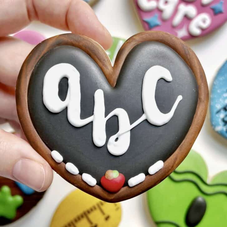
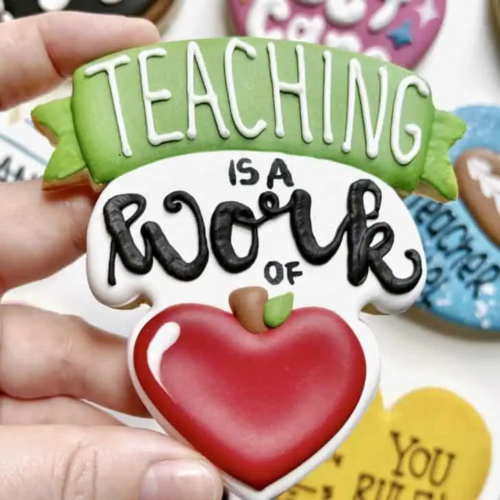
Whether or not you need to lift the icing off the surface of the cookie depends on what kind of lettering that you’re doing. In the case of “teaching” below, you are lifting the icing after every touch down/contact at a corner. For “work” you are only lifting the icing on the up strokes (the down strokes are pressure piped and flush with the surface of the cookie).
Lifting the icing vs. staying flush creates two entirely different effects with the icing, as you can see below.
Keep your eyes ahead while writing
Guide your icing as you go. It’s kind of like reading music: you always want your eyes to be ahead of your icing. Lay the icing down as you are guiding it from point to point (that is, when you are lifting your bag off the surface). Same principle stands if you’re doing consistent pressure piping!
Use your scribe!
I only use a scribe when it’s absolutely necessary, since every time you pick up a scribe it adds time to an already lengthy process. In the case of writing with royal icing, it can definitely make a difference!
The first way you can use it is to smooth the thick/down stroke of the combination pressure piped lettering. This has to be done quite quickly before the icing starts to crust. In the example below, I’d do it after every chunk of lettering: GI – VE – THA – NKS.
Do I always do this? Goodness, no. Maybe 1 out of every 10 sets I’ll actually settle the down strokes. Otherwise, I just leave them as is and call it good enough. I don’t mind if there’s some texture to my downstrokes 😉

The one time I will ALWAYS encourage using a scribe for writing is with the outline and flood technique. Using a scribe will give you the most seamless look:
- When doing the outline, use your scribe to gently settle each intersection of lines connecting the letters and where the bars join
- Flood the bars immediately after piping the outline (instead of piping a bunch of outlines and then flooding)
- When flooding the bars, flood one bar at a time and use your scribe to gently bring the icing to the corners and “lay” the icing on top of each corner to cover the outline
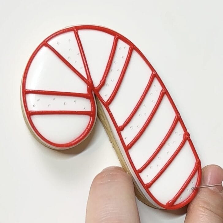
How to prevent craters
When doing the outline and flood technique for writing, you’re likely to get craters in the flood portion. There are 3 different ways that you can prevent craters:
- Add the writing 15-30 minutes after the base flood has crusted (instead of waiting for the flood to completely dry.
- Add an extra line in between the bars
- Poke holes in the base flood (I find this works better when the base flood is quite dry/has dried for at least 2-4 hours)
Add a line (also used when the flood had crusted for 30 minutes):
Poke holes:
Use a hand-lettered plaque for easier writing
One of the easiest ways to cheat the code with royal icing writing is to use a hand-lettered plaque to start! These are cookie cutter shapes that were designed around hand-lettering. The downside is that they can’t really be used for anything else, but the upside is that they made freehanded lettering SO much easier! Or, of course, you can project the image from website with your projector and trace it (since you are purchasing the cutter you are also purchasing the right to use the lettering).
This Miss to Mrs plaque is a classic example.
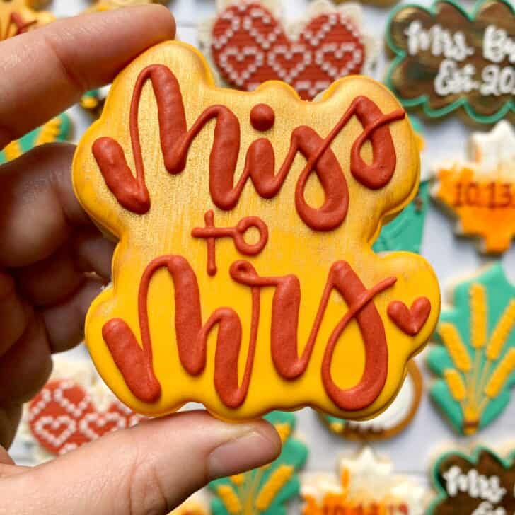
How to use the hand-lettered plaque to your advantage:
- Use the curves of the plaque to guide you as you lay down the outline
- Do NOT bring the outline of the letter all the way to the edge (leave 1/8″ or less, sometimes just a couple millimeters)
Another option is to select a general cookie cutter shape where the cutter company has already designed hand-lettering to be included with cookie cutter. Again, since you are purchasing the cutter, you have the right to use the lettering as well. This Fall in a Cup (I used the 4″ size) is a great example.
If you’re painting the icing lettering…
If you’re painting the writing with say gold or silver luster dust, you have two choices for what color to pipe the lettering: either the same color as the base flood OR a similar color to the luster dust (golden yellow for gold and grey for silver).
I almost always do the first option: same color as the flood. This is for two reasons: 1) if you don’t obsessively paint every nook and cranny of the letter (I mean, who does?!), then you can’t see the imperfections because it blends right in with the flood color and 2) you don’t have to make a new color just for the lettering and you likely need the soft peak piping consistency for something else in the set too.
The argument for the latter choice (similar color to the luster dust) is that it makes the coverage of the luster dust look better/deeper/richer. This is especially true when you’re using a completely edible luster dust like the dusts from The Sugar Art (which is what I used).
If you’re using the non-toxic (but not edible) dusts, those have incredible coverage and you can’t tell at all what color you’re painting over. I personally think the dusts from The Sugar Art are good enough and so I don’t bother with this second option 9 times out of 10.
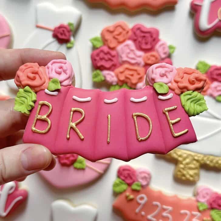
Want to learn exactly how to make this bridal set from start to finish? Check out my online Bridal Shower class!
Breath!
This might seem obvious, but I always remind my students (and myself!) to breathe. It’s so easy when doing something extra challenging (like writing with royal icing) to hold your breath, which further stresses your body out. Breathe, baby, breathe!
Practice, practice, practice!
Practice makes better! You can certainly get a lot of practice in just by making more cookies, but if you’d like some purely practice time devoted to lettering I’d suggest purchasing a lettering guide to practice on. Check out the writing guide that I have here from Bossy Brushstrokes (this link isn’t sponsored at all, I just love Arlena and this guide!).
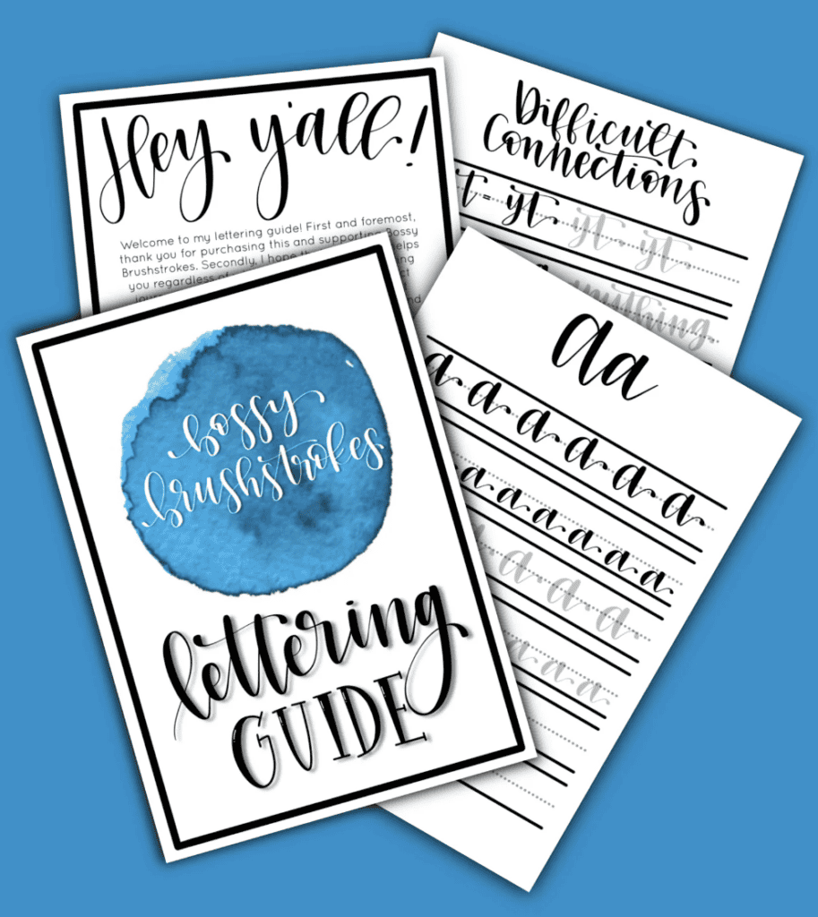
I actually own this guide myself from Bossy Brushstrokes and spend quite a bit to have it laminated, but it was so worth it! Arlena is a calligrapher and while this guide was designed for pens, it’s perfect for royal icing practice. Since mine is laminated I can use it over and over again (but you could always print out as many pages as you want).
Be kind to yourself
Last, but certainly not least: please be kind to yourself! Writing is hard for everyone (even the experts sometimes). Those that are really good at writing with royal icing have been perfecting their craft for YEARS.
Chances are your lettering is going to look wonky for quite awhile, but that’s ok! Be proud of your work and proud that you’re even trying lettering in the first place! So many people just avoid it altogether.
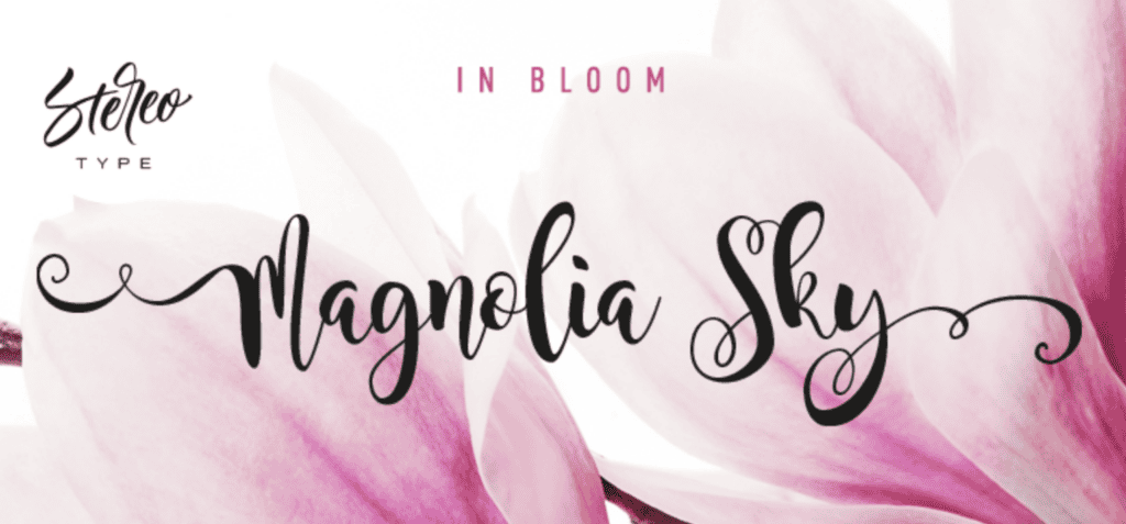
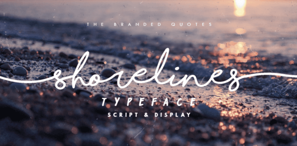
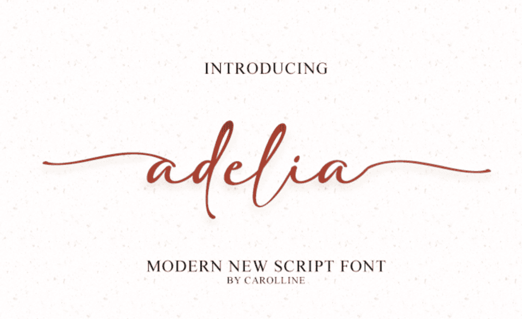
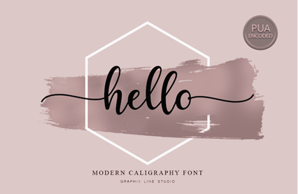
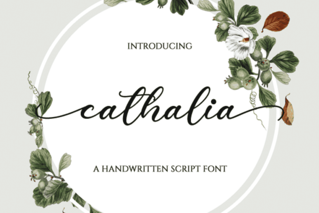
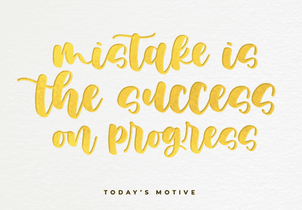
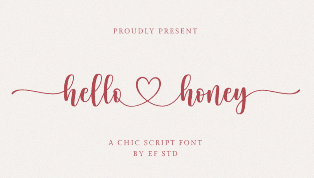
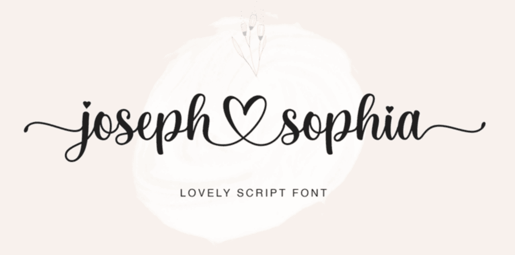
My Favorite Fonts for Writing with Royal Icing
When you see fancy/uniform lettering on my cookies, it’s either because 1) I used lettering provided in a cutter I purchased, 2) I had custom lettering done, 3) I purchased an STL file of lettering I like from an Etsy shop or 3) I downloaded/purchased a font from the internet. My favorite font website is dafont.com. Please confirm the terms of use before downloading/using any fonts.
I’ll admit it’s been a minute since I’ve done a lot of writing with royal icing so I’ve forgotten some of my favorite fonts, but here are some that I remember:


mitolyn reviews
Tuesday 8th of April 2025
Your vulnerability and honesty in your posts is truly admirable Thank you for being so open and authentic with your readers
thegracefulbaker
Tuesday 8th of April 2025
you're welcome! :)
Elizabeth
Sunday 2nd of February 2025
I loved the resource ideas for writing styles. This is so helpful! I would definitely print the practice sheets and laminate them.
thegracefulbaker
Monday 3rd of February 2025
So glad you find this helpful!!!
Karen E Strauss
Sunday 8th of September 2024
Would love to see this as an online video tutorial. Would for sure sign up for it.
thegracefulbaker
Monday 16th of September 2024
Good to know!! I'll add that to my list of potential future offerings :)